How to Resize Images on Mac: Batch Resize Guide
Resize images mac the right way: plan by longest edge, handle Retina 2x, batch sets with mixed orientations, and use Zipic's Auto aspect-ratio workflow.
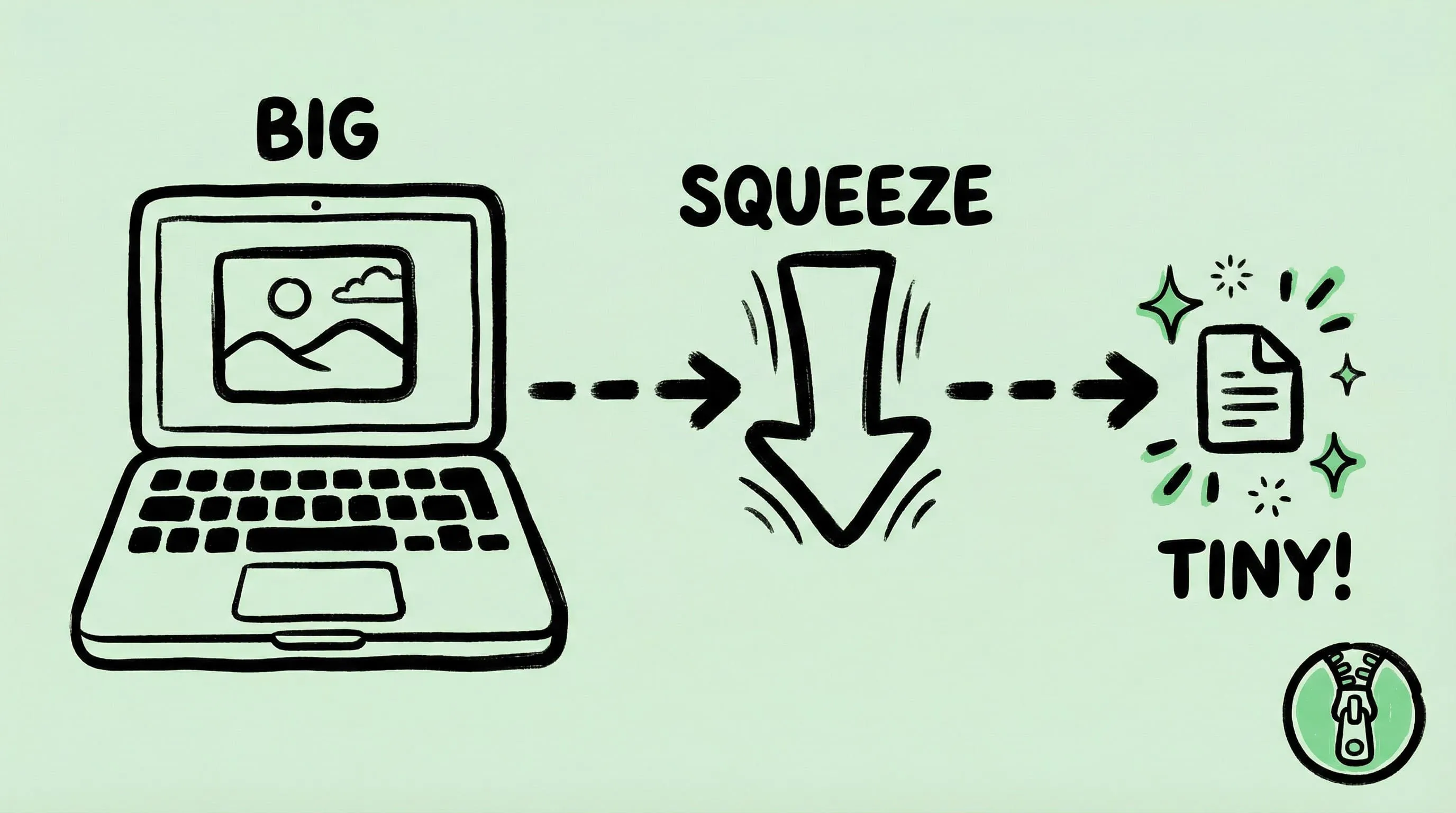
Most people searching for resize images mac are actually trying to solve two different problems at once: the image has too many pixels, and the file is too big. Those are not the same thing, and treating them the same is why so many exports come out either soft or unnecessarily huge. This guide focuses on the first half — pure dimensions — and links out to the compression articles for the second half.
Resize vs compress: why this distinction matters
Resizing changes the pixel dimensions of an image. A 4000x3000 photo becomes 1600x1200. The picture now contains fewer pixels, period.
Compressing changes how those pixels are stored. The same 1600x1200 photo might weigh 1.2 MB as a high-quality JPEG or 280 KB as a WebP — identical dimensions, different bytes on disk.
Both tools reduce file size, but they fix different root causes. A 24 MP photo destined for a 1200 px blog column is “too big” because of dimensions. A perfectly sized hero image that is still 4 MB is “too big” because of compression. Resize first when pixels are the problem; compress when bytes are the problem. If you need both, do them in the same pass.
The rest of this article is about the first one.
Plan by the longest edge, not by width alone
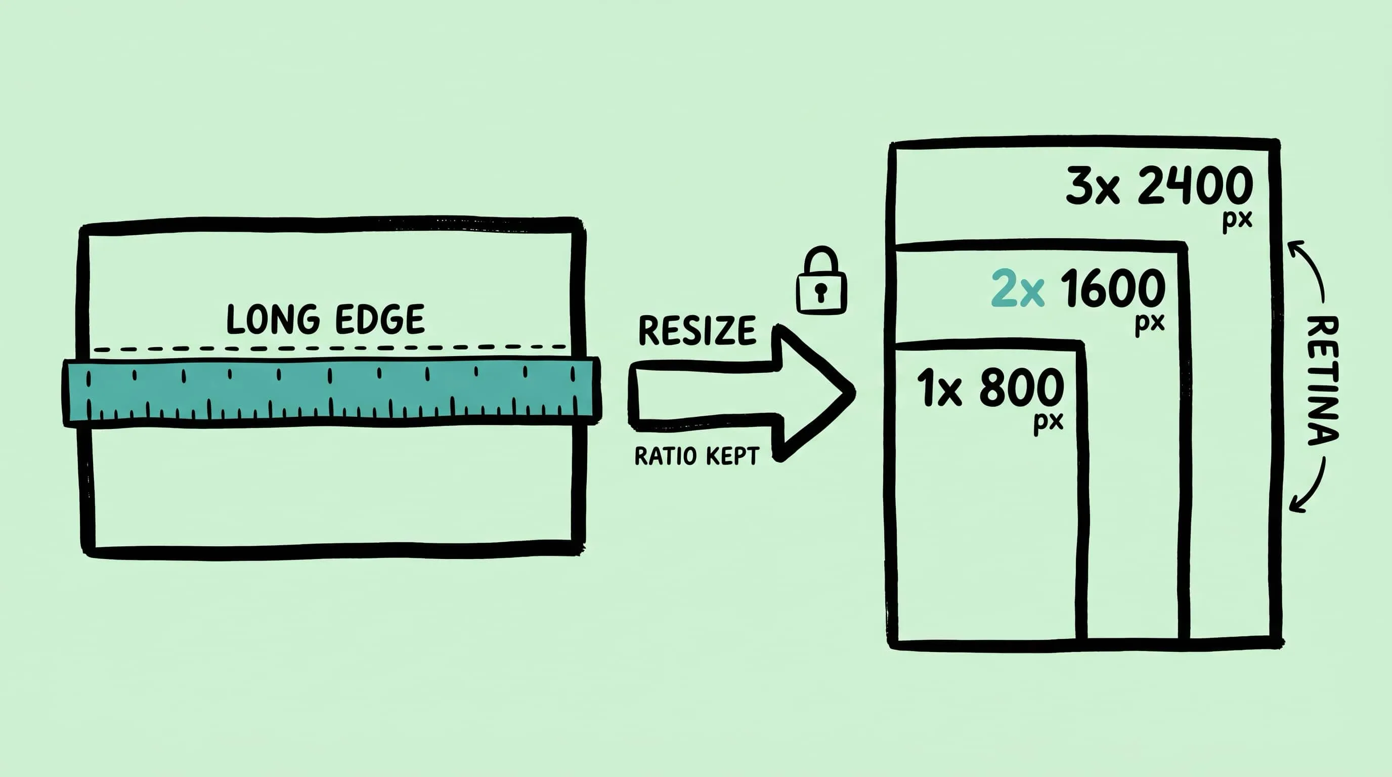
A common mistake is writing a preset that says “width = 1600 px” and running it over a mixed batch of landscape, portrait, and square photos. The landscape shots come out correctly at 1600 wide. The portrait shots come out 1600 wide, but that means the height balloons to 2400 or more — they are now taller than the landscape shots, which is rarely what you want.
The longest-edge mental model fixes this. Instead of thinking “I want images this wide”, think “I want the longest side of each image to be no more than N pixels”. Every orientation ends up with the same maximum footprint on screen.
Rules of thumb I use (treat as starting points, not standards):
- Full-width hero images on a modern site: longest edge ~1920–2400 px.
- Inline blog figures: longest edge ~1200–1600 px (covers most article column widths at 2x).
- Grid thumbnails, avatars, product tiles: longest edge 400–800 px.
- Email attachments / Slack drops: longest edge 1600 px is almost always enough; 2400 px if the recipient might zoom.
- Archive copies of originals: do not resize, keep the master untouched.
These are author heuristics. For authoritative responsive-image sizing, MDN’s srcset and sizes guide (developer.mozilla.org) is the reference — common breakpoints in the wild are 320, 480, 640, 768, 1024, 1280, 1536, and 1920.
Retina 1x vs 2x vs 3x: the pixel doubling tax
If you serve an 800-pixel asset into an 800 CSS-pixel column on a MacBook, it looks fine on an old external monitor and noticeably soft on any Retina Mac. That is the 2x tax.
Apple’s developer documentation describes this as the scale factor: standard displays draw one device pixel per CSS point, Retina displays draw four (2x), and some iPhones draw nine (3x). See Apple’s Human Interface Guidelines for images. Practically, that means:
- For a column that renders at 800 CSS pixels wide, export the asset at 1600 pixels wide for 2x crispness. A 2400 px version covers 3x phones but doubles the byte count for a visual gain most desktop users will not see.
- For a thumbnail that renders at 200 CSS pixels, export 400 px. Thumbnails benefit from 2x more than anything else because they are viewed close-up.
- For an email signature logo rendered at 120 CSS pixels, export 240 px — do not ship a 1200 px logo “just in case”. Email clients will not downscale it efficiently and bytes are expensive in that context.
The pattern is simple: decide the layout size in CSS pixels, multiply by 2 for Retina, that is your pixel-dimension target.
Aspect ratio: preserve, or go uniform
Zipic’s resize enforces aspect ratio preservation by default. According to the official docs, if you set a target width and leave height on Auto (or vice versa), Zipic scales the other axis proportionally. If you set both dimensions, Zipic picks one as the reference and adjusts the other to keep the aspect ratio rather than stretching. The docs also state explicitly that Zipic does not currently crop images — this matters for batch safety because you never accidentally chop off a subject’s head.
Three strategies covered by that behavior:
- Ratio-preserving resize (the default). Set width OR height, leave the other on Auto. Best for mixed real-world photography where composition is already intentional.
- Uniform long-edge cap. Set the longer axis to your ceiling (say, 1600 px) and leave the short one on Auto. Works whether the input is portrait or landscape.
- Fixed-ratio grids — e.g. a 1:1 product tile or 16:9 video thumbnail grid. Zipic does not crop today, so for hard-edge consistency you either feed it pre-cropped sources, or run a dedicated crop step first (Preview, a ratio-aware script, etc.) and then send them through Zipic for the resize + compress pass.
The third case is worth being honest about: if your publishing pipeline demands exact 1080x1080 tiles with subjects centered, Zipic is not the cropping tool. Pre-crop, then resize in Zipic.
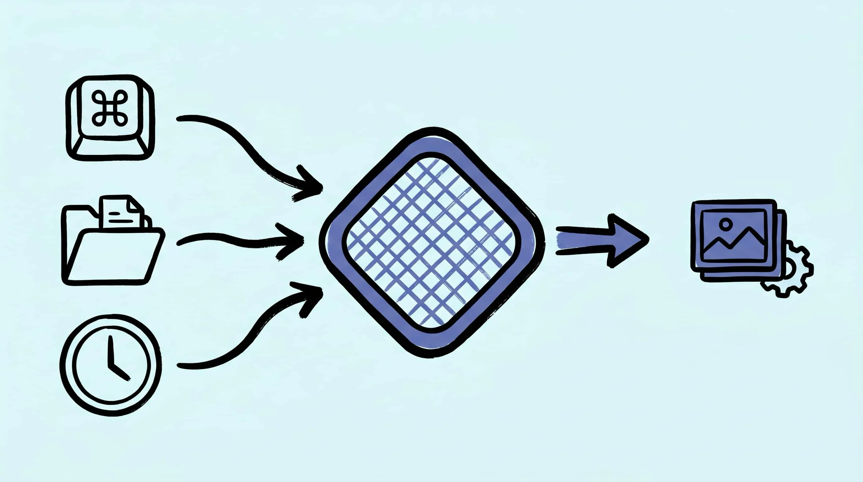
Zipic resize workflow
The whole workflow lives inside a compression preset, not a separate tool. Open Zipic, click the Compression Settings button at the bottom-left of the main window, pick or create a preset, and click the edit icon to expose the options.
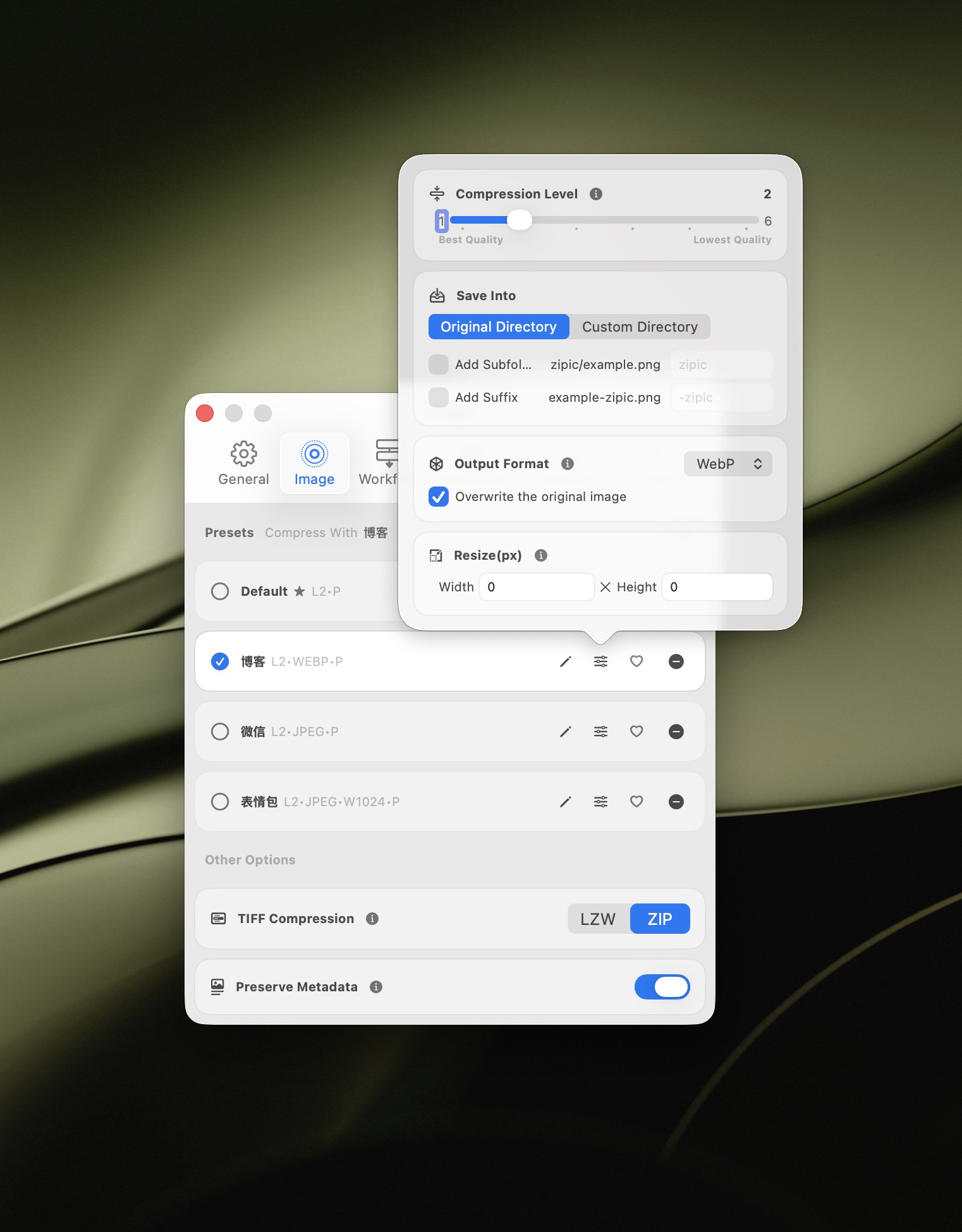
Inside the preset editor you will find Size controls for resize. Set either Width or Height to the pixel value you want, and leave the other field as Auto. That is how you change image dimensions mac-side without distorting anything. A typical “web 2x” preset for a 1200 CSS px column would be Width 2400, Height Auto.
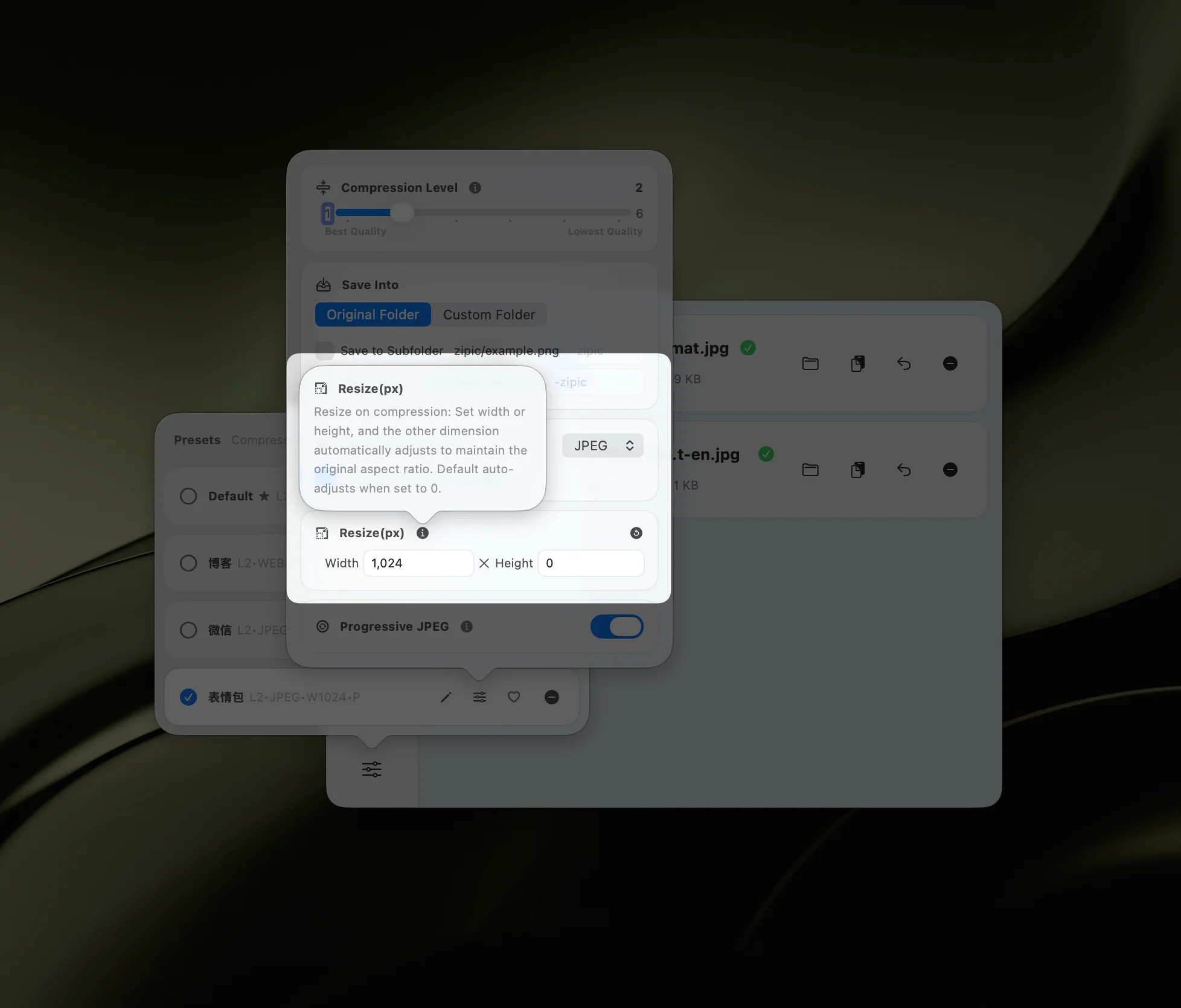
A few behaviors worth knowing from the docs:
- If the target dimension is larger than the source, Zipic will not upscale. A 900 px photo sent through a “width 1600” preset stays at 900 px. You never accidentally blow a small image into a blurry big one.
- The Reset button in the resize panel returns Width and Height to Auto, which disables resizing for that preset.
- You can save multiple presets — “Web 2x 1600”, “Thumbnail 800”, “Email 1200” — and switch between them in a click from the main window.
Once the preset is set, drop files or folders into the main window and Zipic applies the resize plus any compression or format conversion from that preset in a single pass.
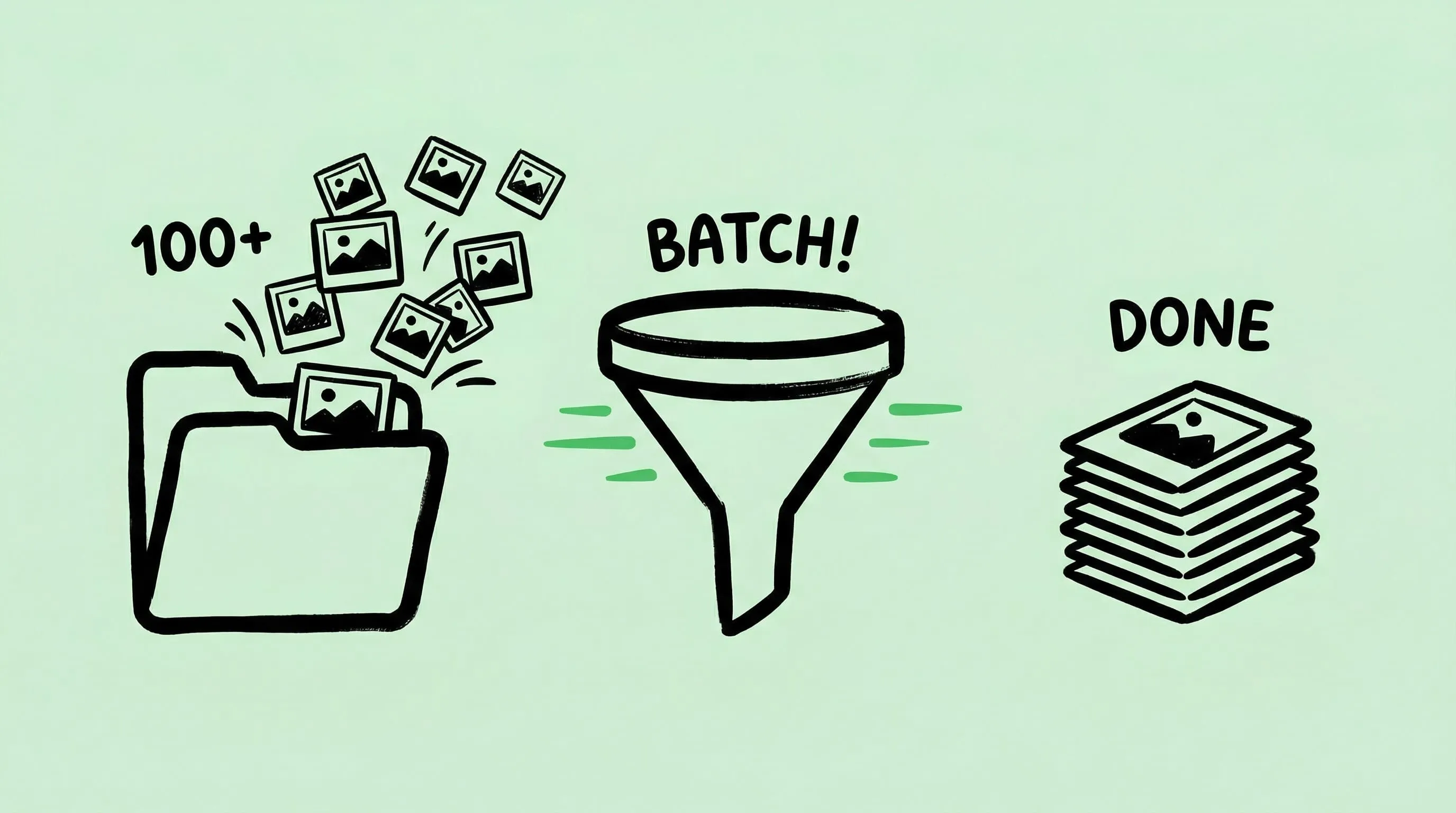
Batch patterns that actually save time
A few concrete patterns this unlocks:
- Mixed orientations in one folder. Use a single long-edge preset (say Width on landscape-oriented shots and Height set on portraits — or just pick the larger of the two axes as your cap). In practice, setting only Height to 1600 with Width on Auto caps vertical space; setting only Width to 1600 caps horizontal. Pick the one that matches how the images will be laid out.
- 2x export pipeline. Keep two presets side by side: “Site 1x 1200” and “Site 2x 2400”. Run the same folder through both, save into separate output folders, and upload both sets. Combine with
<img srcset>in your template. - Percentage-style downscaling with Height or Width math. Zipic’s resize takes absolute pixel values rather than percentages, so to halve a batch uniformly you typically pick a target dimension (e.g. 50% of your known source width). If your sources are consistent, that is the same result as a percentage scale.
- Preview-quality drafts. Make a “Preview 800” preset that caps the longest edge at 800 px with aggressive compression. Great for sharing drafts in Slack without uploading a 40 MB folder.
After you resize, compress
Once dimensions are correct, file size is the next concern — and that is a separate conversation. If you need an image under a hard KB limit for a platform uploader, see Compress Images to a Specific Size. If you just want a sane default pass over a whole folder, Batch Compress Images on Mac walks through preset setup. The resize preset you built here can compress in the same pass, so you rarely need two tools.
Research Notes
Verified on 2026-04-23 against:
- Apple Human Interface Guidelines: Images (Retina scale factors of 1x, 2x, and 3x).
- MDN Web Docs: Responsive images (srcset and sizes) for standard breakpoint conventions.
- Zipic docs: Resizing Images — source of the aspect-ratio and no-crop behavior described above.
- Zipic docs: Basic Image Compression — preset workflow and drag-and-drop entry points.
Pixel targets in the “longest edge” and “Retina” sections are author rules-of-thumb unless explicitly sourced. Your production site’s layout and its own sizes attribute are the final word.
Related Articles
- Batch Compress Images on Mac
- Compress Images to a Specific Size
- Optimize Images for Web Performance
- How to Compress Images on Mac
Full documentation: Resizing Images · Image Compression Basic
Ready to stop eyeballing image dimensions? Download Zipic and start with the free daily allowance. Every download includes a full 7-day Pro trial. Zipic Pro unlocks unlimited compression, advanced formats, folder monitoring, URL Scheme automation, and workflow features for serious batches.
Related Reading
Batch Compress Images on Mac: 5 Fast Methods That Scale
Batch compress images on Mac with folders, Finder, Raycast, monitoring, or Shortcuts. Compare setup, automation, Pro needs, and safe output options.
How to Compress Images on Mac: 5 Methods That Work
Learn how to compress images on Mac with drag-and-drop, Finder, presets, format conversion, and batch automation while protecting originals and quality.
Raycast Image Compression: Hotkey Compress with Zipic
Set up Raycast image compression with the Zipic extension on macOS. Install, bind a global hotkey, and compress any Finder selection in one keystroke.
Automate Image Compression with Apple Shortcuts and Zipic
Drive Zipic Pro's native AppIntents from Apple Shortcuts on macOS. Five ways to trigger compression — Quick Action, in-app hotkey, menu bar, Share Sheet, and scheduled automation — paired with five real recipes.