DPI, Compression Ratio & File Size Explained
DPI explained in plain English: learn how pixel dimensions, print size, compression ratio, and image file size actually relate before you resize or compress images.
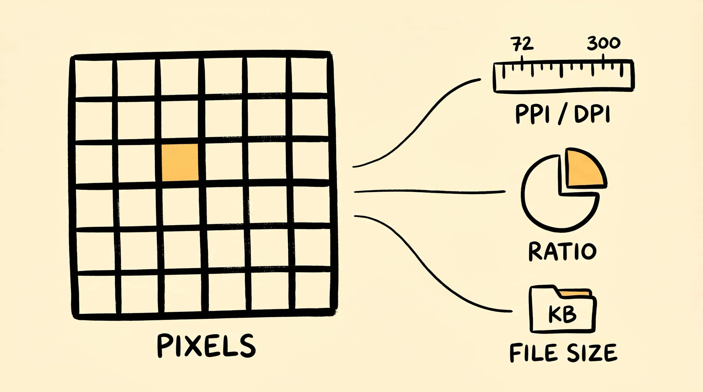
DPI explained gets confusing because people use DPI, PPI, resolution, dimensions, compression ratio, and file size as if they were the same knob. They are not. A 3000 x 2000 pixel image has six million pixels whether a metadata field says 72 PPI or 300 PPI; the number changes print math, not the actual pixel grid.
This guide is intentionally educational. For web and sharing images, Zipic helps with compression level, output format, and pixel dimensions. DPI metadata is outside the workflow described here; tiny distinction, very real pothole.
DPI Explained: Pixels, PPI, and Print Size
DPI means dots per inch and belongs mostly to printing. PPI means pixels per inch and describes how many image pixels map to one physical inch when an image is printed or placed in a layout tool. In casual speech people often say DPI when they mean PPI, so the safest question is: how many pixels do I have, and how large will they be displayed?
For print math, divide pixel dimensions by the intended density. A 3000 px wide image printed at 300 PPI is 10 inches wide. The same image printed at 150 PPI is 20 inches wide. No new detail appears just because the density tag changes; only the intended physical size changes.
For websites, social posts, and email, pixel dimensions matter more than a DPI label. Browsers choose image resources based on CSS layout, viewport, and device pixel ratio, as explained in MDN’s responsive images guide. A 1600 px image is still 1600 px wide on the web even if the metadata says 72 PPI.
Compression Ratio Explained
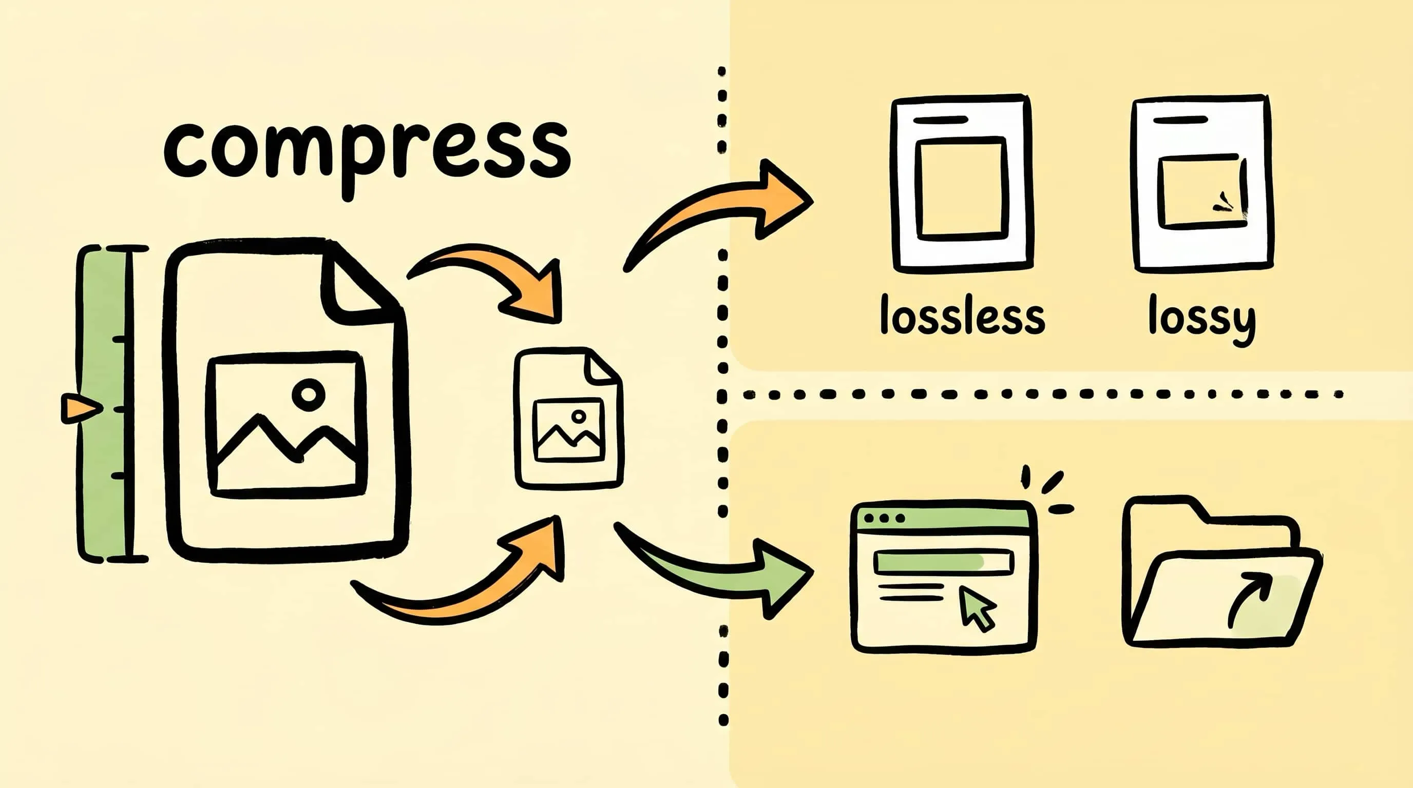
Compression ratio compares the original file size with the compressed result. If a 4 MB file becomes 1 MB, the size is reduced by 75%, or the compressed file is one quarter of the original. That number is useful, but it is not a quality score.
Two images can show the same compression ratio and look completely different. A flat UI screenshot compresses easily; a noisy night photo or detailed fabric texture resists compression. This is why serious image workflows check the visual result instead of trusting a percentage alone.
Image File Size Explained
File size is affected by four main things:
- Pixel count: more pixels usually means more data.
- Image format: JPEG, PNG, WebP, AVIF, HEIC, TIFF, and GIF store data differently.
- Compression settings: stronger lossy compression removes more visual data.
- Metadata and color data: camera information, thumbnails, and color profiles can add bytes.
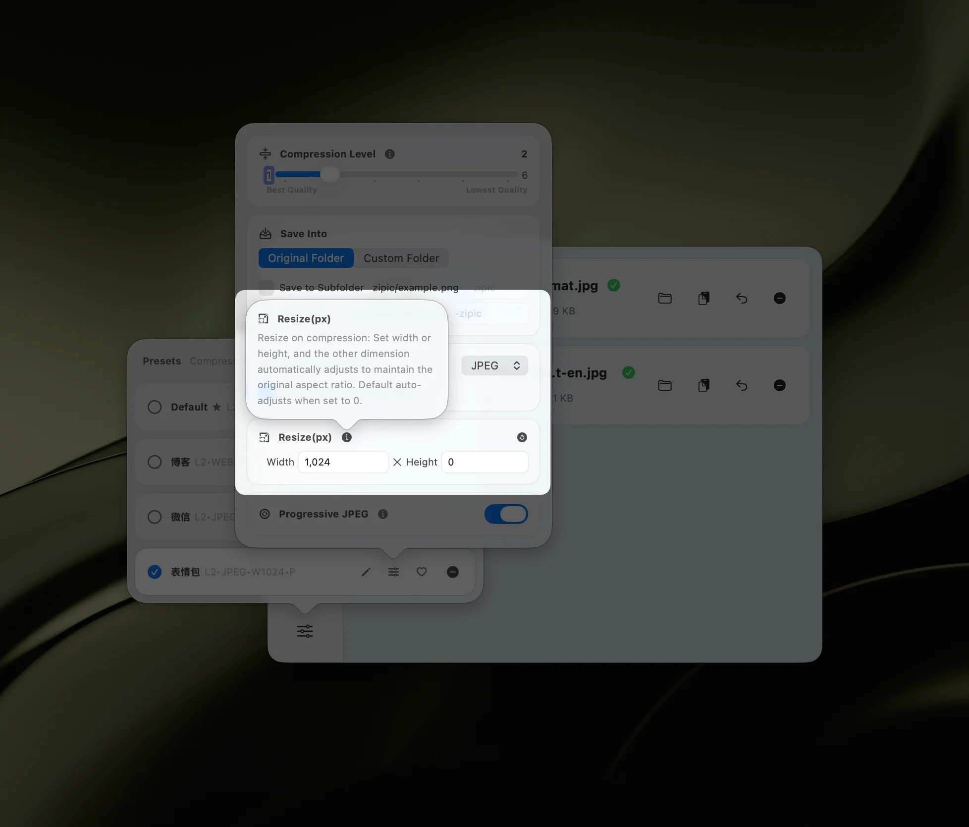
The fastest way to reduce file size for web use is usually to resize to the real display need first, then compress. If an article column displays images around 1200 px wide, uploading a 6000 px camera export is mainly donating bandwidth to nobody.
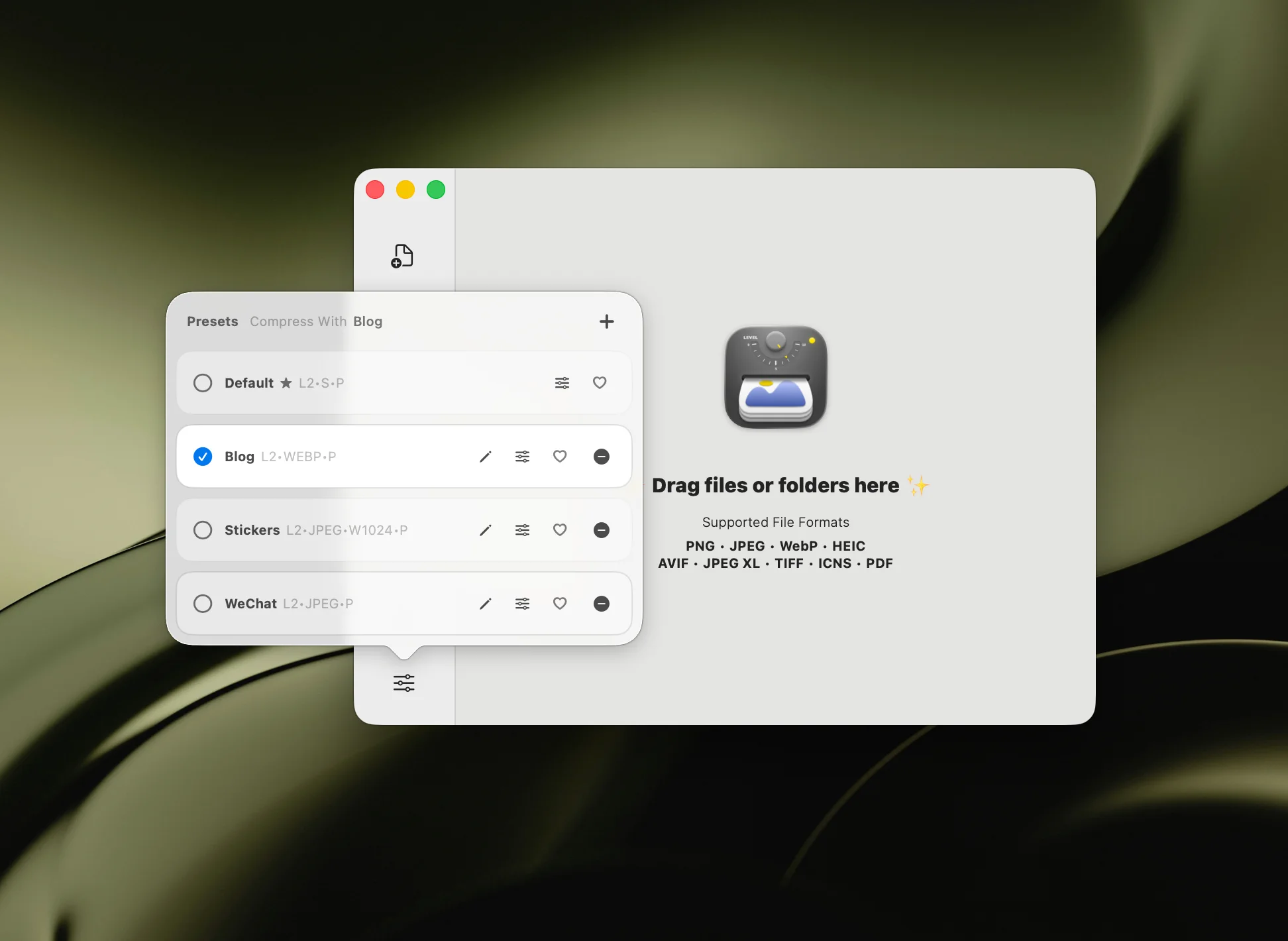
Where Zipic Fits
In Zipic, start with the preset menu, then set compression level, output format, and optional resize dimensions. After that, add images or folders and Zipic compresses automatically.
For DPI-sensitive print production, keep using your layout or photo editing tool to manage print size and resolution metadata. For web, email, documentation, and app assets, use Zipic for the practical levers: pixels, format, and compression.
If those images will be placed in a PDF with a strict upload cap, do not pick one PPI value blindly. Diagnose a representative PDF page first, then compare its size with the document’s per-page budget.
Research Notes
This article was checked against Adobe PPI guide, MDN responsive images, and MDN device pixel ratio notes and the Zipic Image Compression Basic documentation on 2026-04-23.
Related Articles
- What Is Image Compression?
- Lossy vs Lossless Compression Explained
- How to Reduce JPEG File Size Without Losing Quality
- Compress Images to Specific File Size
Full documentation: Image Compression Basic · Choosing Image Formats · Resizing Images
Ready to make image compression less manual? Download Zipic and start with the free daily allowance. Every download includes a full 7-day Pro trial. Zipic Pro unlocks unlimited compression, advanced formats, folder monitoring, URL Scheme automation, and workflow features for serious batches.
Related Reading
What Is Image Compression? A Beginner's Guide for Mac Users
What is image compression, and why does it matter? This beginner's guide explains how image compression works, lossy vs lossless, and how to compress images on Mac.
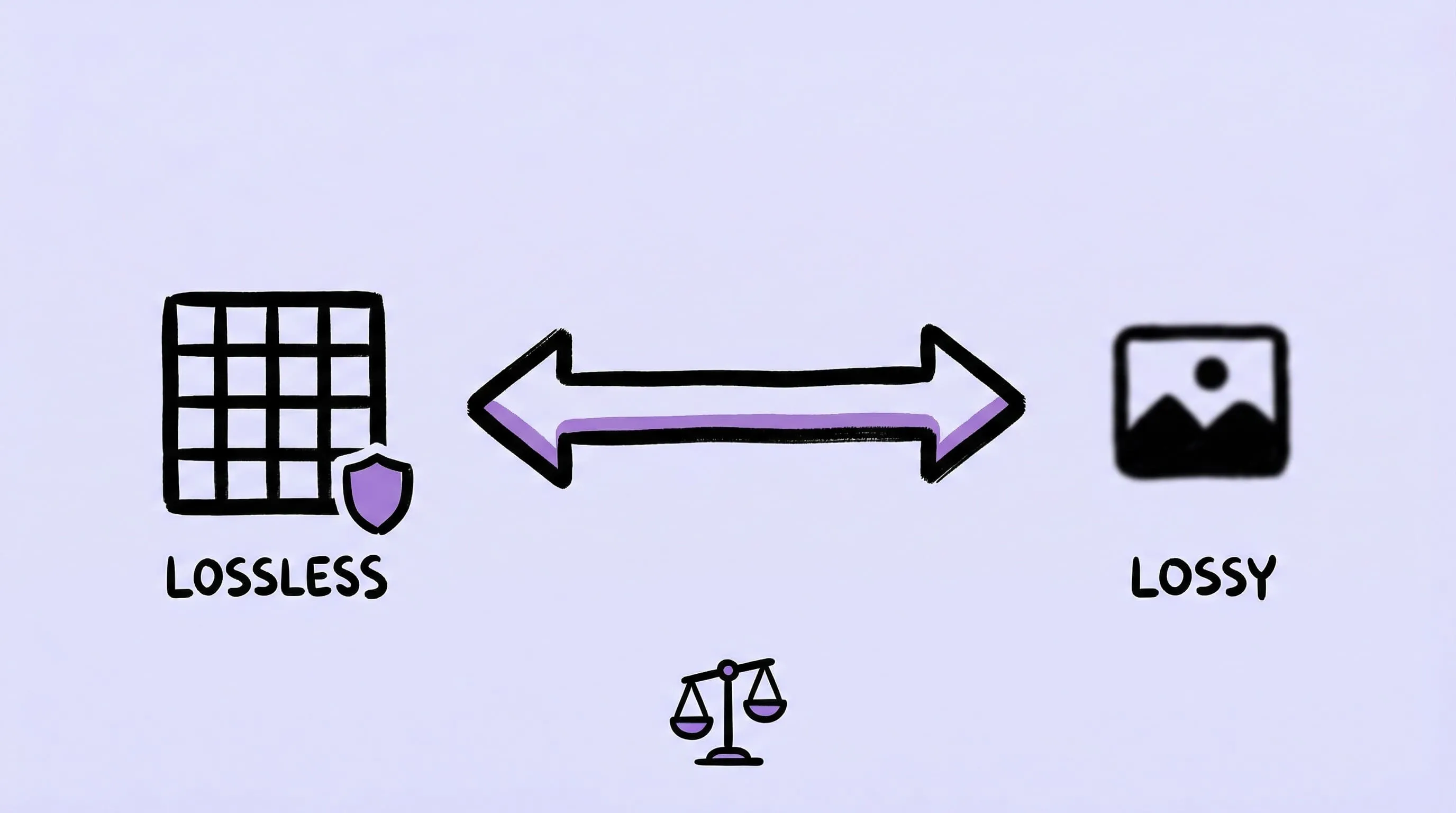
Lossy vs Lossless Compression: Differences and Best Uses
Compare lossy vs lossless compression, learn how each method works, and choose the right option for photos, screenshots, web images, editing, and archives.
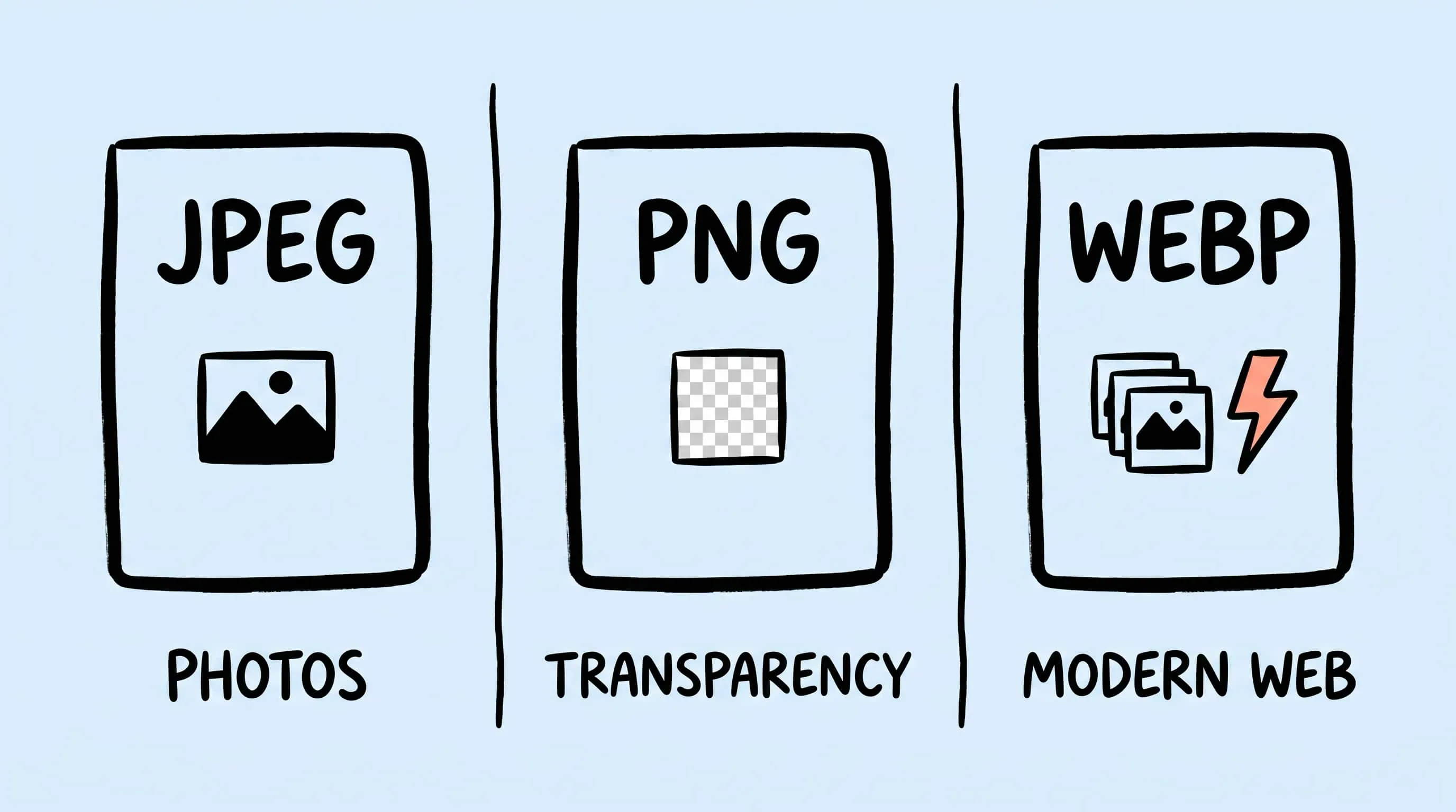
JPEG vs PNG vs WebP: Which Image Format Should You Use?
Compare JPEG vs PNG vs WebP for file size, image quality, transparency, animation, and compatibility, then choose the best format for every use case.
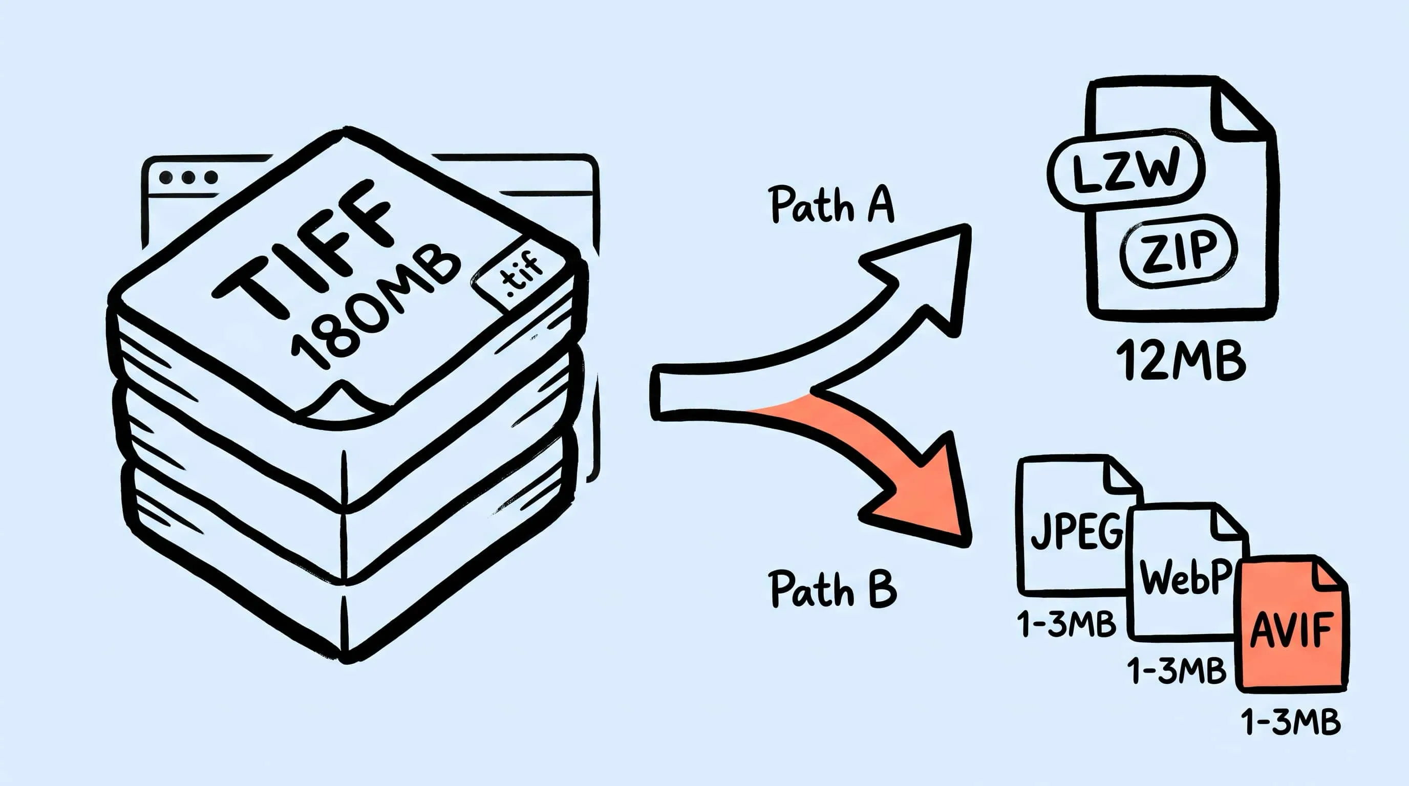
TIFF Compression: How to Reduce Large TIFF Files on Mac
Compress TIFF files on Mac without losing quality. Compare LZW vs ZIP, shrink 100 MB scans, and batch convert TIFF to JPEG, WebP, AVIF, HEIC, or JXL with Zipic.